Services
UI/UX Design · Branding & Identity · Webflow Development · Email Automation
Client
IgnitePoint Studio, Calgary CA.
Tools used
Figma · Webflow · Photoshop · Illustrator · Claude · Zapier · Brevo · Make
Project Timeline
4weeks
What was the problem?
Building a brand that get heard, but doesn’t need to shout
When The Catalyst first came to me, it was not positioned as just another podcast or content platform. It was presented as a cultural intervention in progress — a space intended to challenge how Africans engage with identity, belief systems, tradition, and modern influence. However, despite the strength of the idea, the founder, Ifeanyi Nwanonaku, was facing a clear problem: the vision was intellectually rich, but it lacked a digital home that could properly communicate its depth, tone, and seriousness without diluting it into the typical “content creator” aesthetic that dominates the internet.
Core challenge and brand goals
The core challenge was clarity and positioning. The project sat at a difficult intersection — part podcast, part essay platform, part cultural think-piece archive. There was a risk that without careful execution, it would be misunderstood as entertainment or motivational content, which was something the client explicitly wanted to avoid. He wanted a platform that felt intentional, almost editorial in nature, where every section communicated depth, restraint, and intellectual tension. A space that did not chase attention but instead demanded engagement.
Visual Identity and Branding
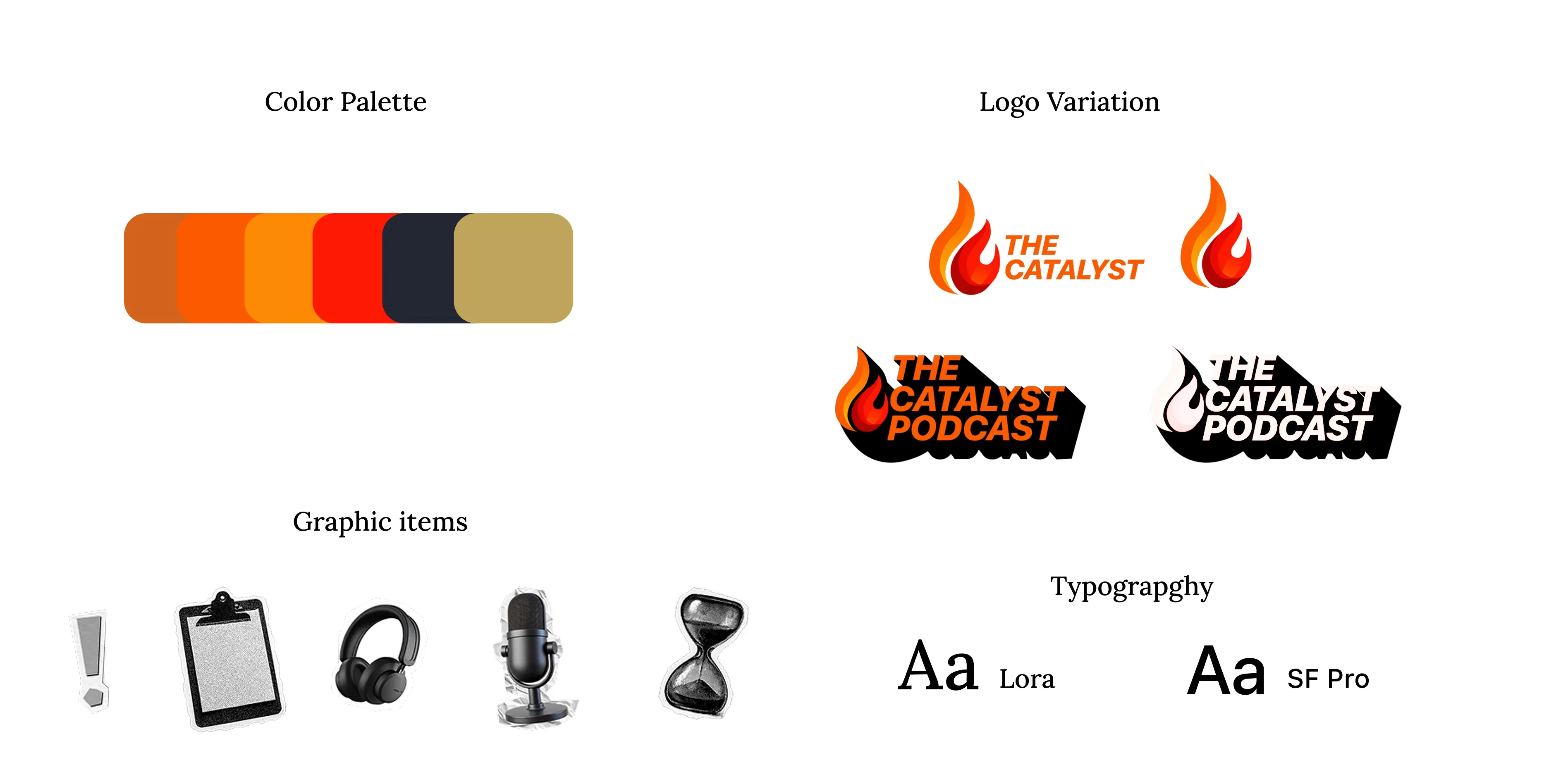
BRANDING: First iterations of brand items and content for The Catalyst Brand which was rejected because design structure and color schemes didn’t align with Founder’s direction.
From a branding perspective, the Image above shows the first sets of color codes, typography, branded items and shouting appearance didn’t effectively depict the tone the brand need. We intentionally had to avoid loud, trend-driven design choices. Instead, we leaned into a more restrained, editorial identity system that felt closer to a digital journal than a media brand.
Typography played a central role in this direction, with a focus on strong hierarchy and intentional spacing to reflect the weight of the content. The visual language was designed to feel calm but assertive, allowing the ideas themselves to carry the emotional weight rather than excessive design ornamentation.
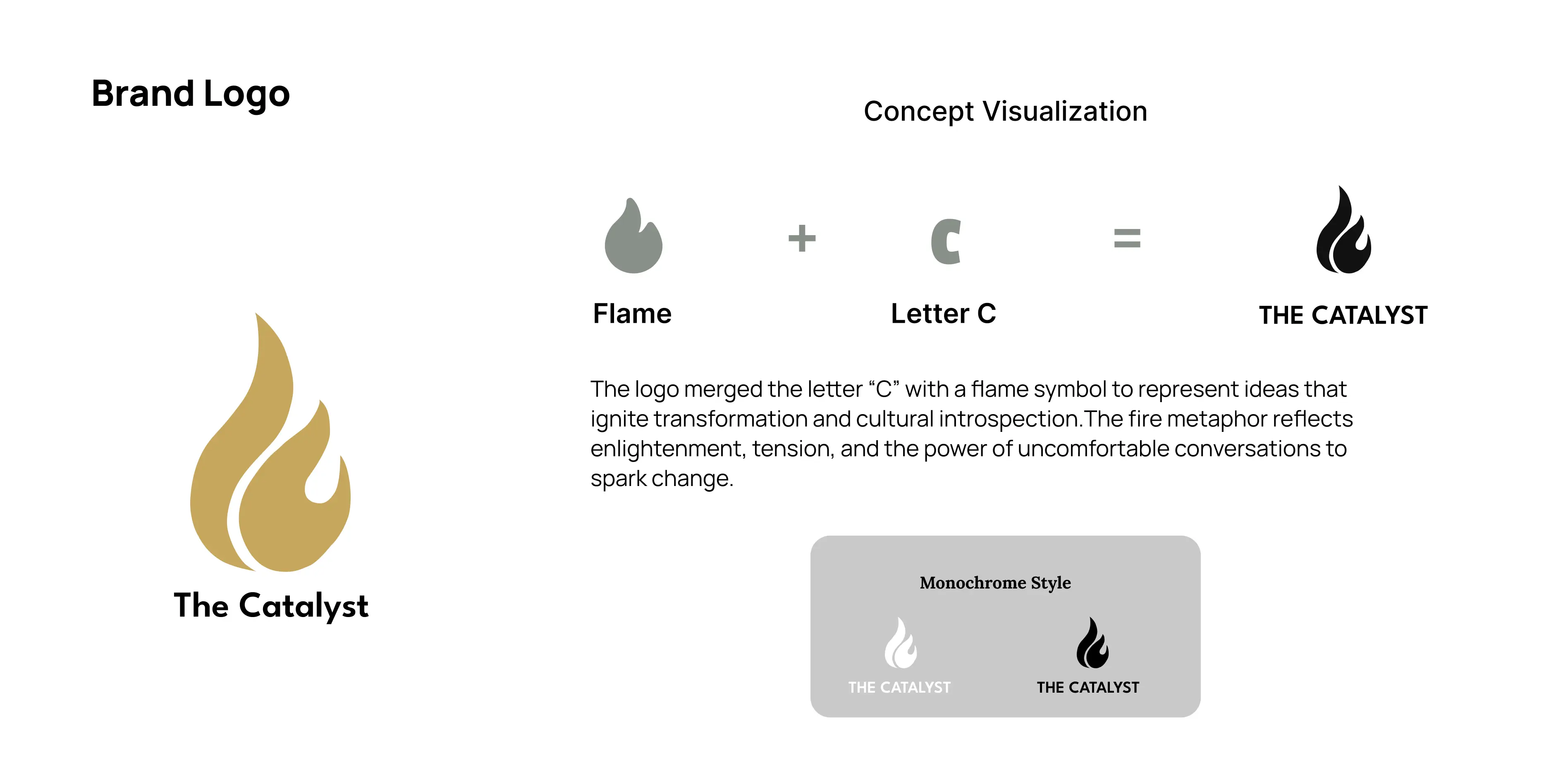
BRANDING: Final deliverables for The Catalyst showcasing the Brand log and concept visualization placing it as a brand that gets heard, but doesn't need to shout.
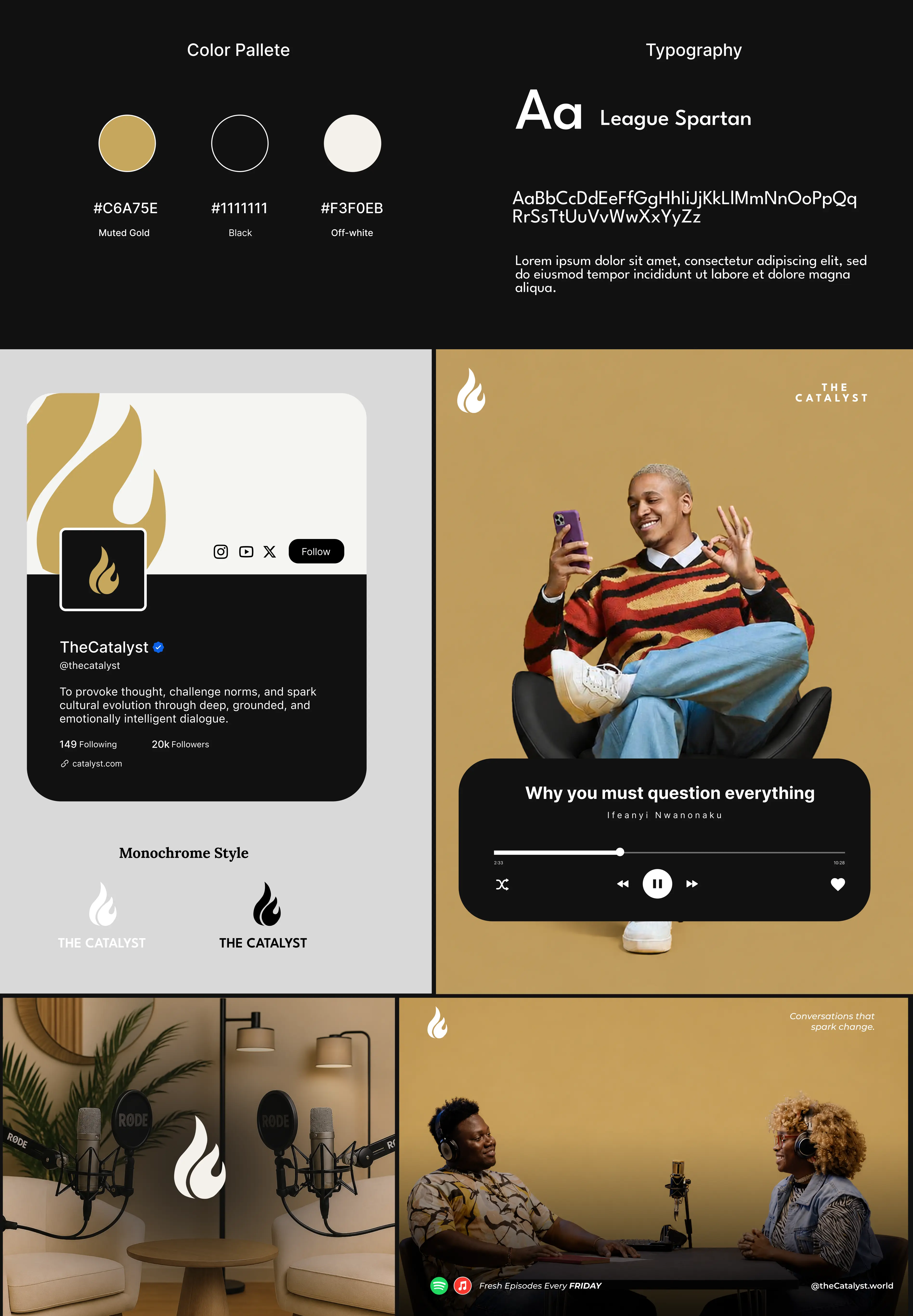
BRANDING: Brand guideline sheet for The Catalyst showcasing logo in different formats, typography, color systems and some mockups for better visualization and brand display.
Building a website for The Catalyst
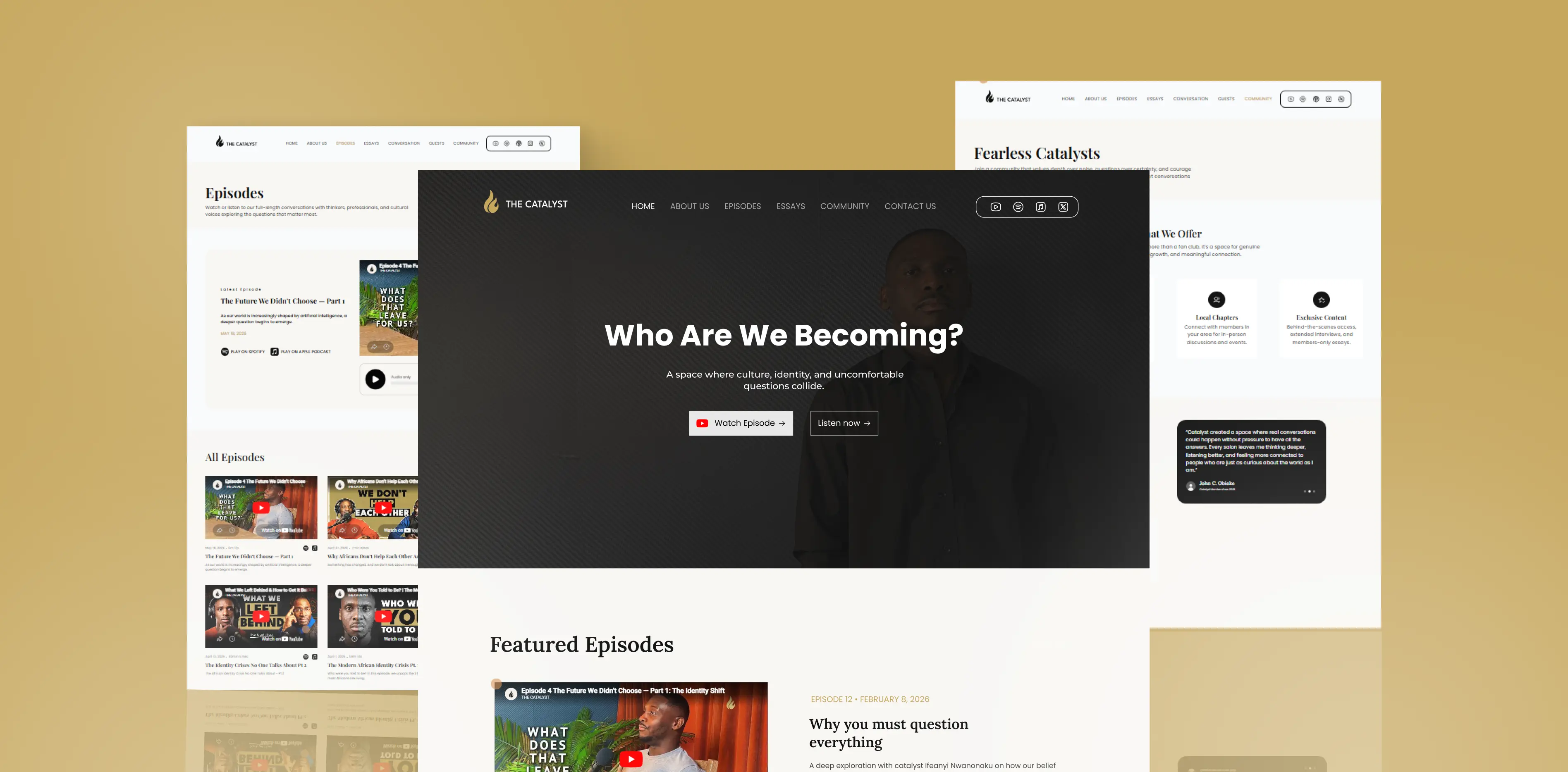
The website structure was then shaped around how users would intellectually move through the platform. We designed it not as a typical podcast site, but as a layered ecosystem of thought. The homepage was built to immediately communicate intent — that The Catalyst is not entertainment-first, but reflection-first. Sections such as Episodes, Essays, and Community were deliberately positioned to mirror how a user might deepen their engagement over time, from passive listening to active participation in ideas.
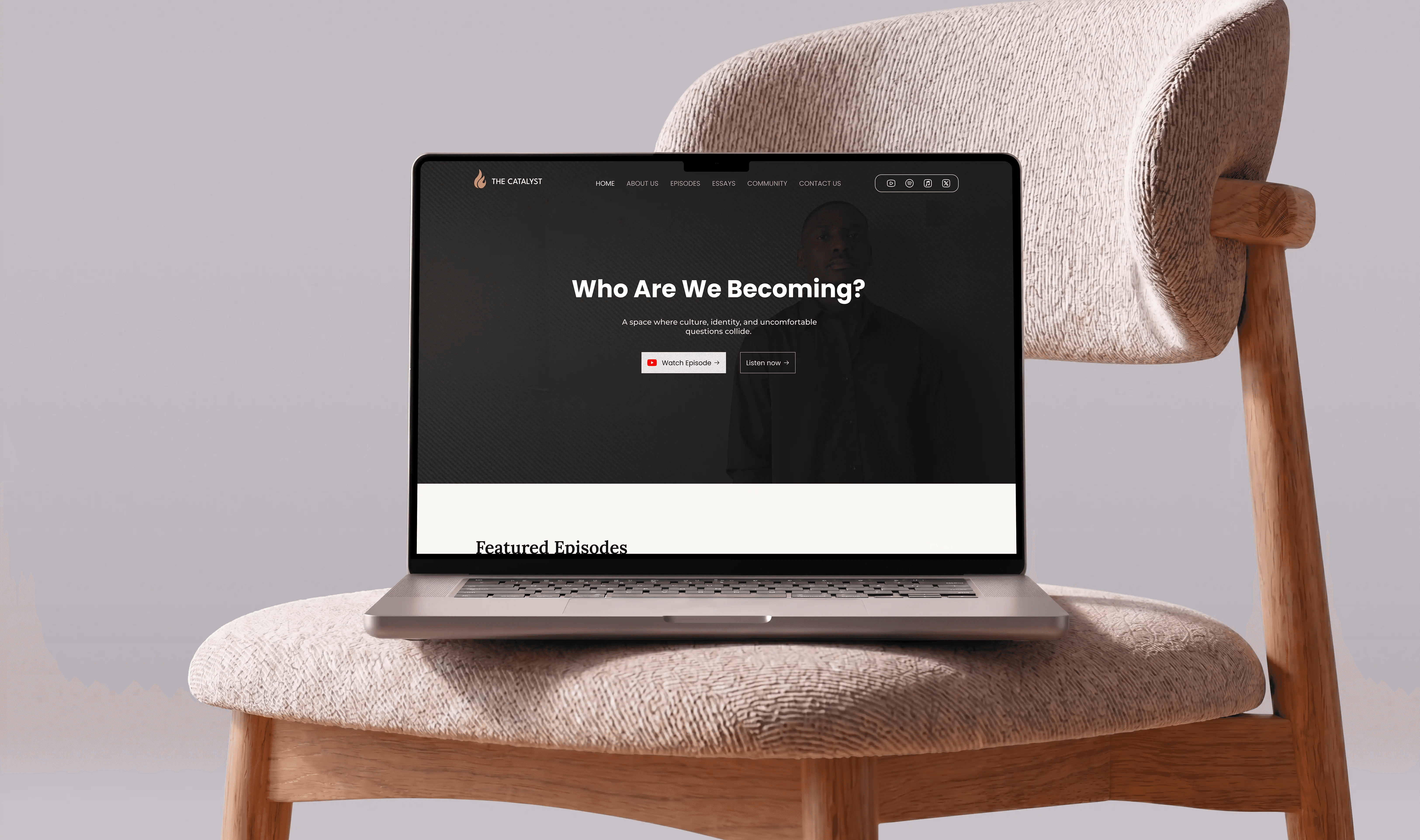
We built flexible content structures that allowed episodes, essays, and reflections to be published seamlessly while maintaining strict design consistency. This ensured that even as the platform grows, it retains its identity and does not devolve into cluttered or inconsistent layouts.
Another major consideration was restraint in interaction design. We avoided unnecessary animations and heavy visual effects, opting instead for subtle transitions that supported readability and focus. Every design decision was filtered through one question: does this help the user think more clearly, or does it distract them?
The final system struck a balance between digital accessibility and intellectual seriousness, allowing complex ideas to feel approachable without being simplified. Ultimately, The Catalyst became more than a website build. It became an exercise in translating philosophy into interface design.
The final product reflected a platform that does not attempt to entertain at surface level, but instead invites users into deeper reflection about identity, culture, and belief. For the client, it provided a digital foundation strong enough to match the ambition of the ideas being expressed.
Conclusion and takeaway from this project
The key takeaway from this project was that not every brand needs to shout to be heard. Some ideas require silence, structure, and intentional pacing to be fully understood. The success of The Catalyst lay in resisting the pressure to over-design and instead building a system that allows thought itself to become the primary visual and emotional experience.
Client Testimonial
"Khaleel did a great job working for me on THE CATALYST website. Patiently implementing my suggestions and changes, that's good customer service. Well done!"
Host, The Catalyst