Services
UI/UX Design · Branding · Web & Mobile App Design · Webflow Development
Client
Problem Exploration (Case Study)
Tools used
Figma · Webflow · Photoshop · Chat GPT · Component Library
Project Timeline
10weeks

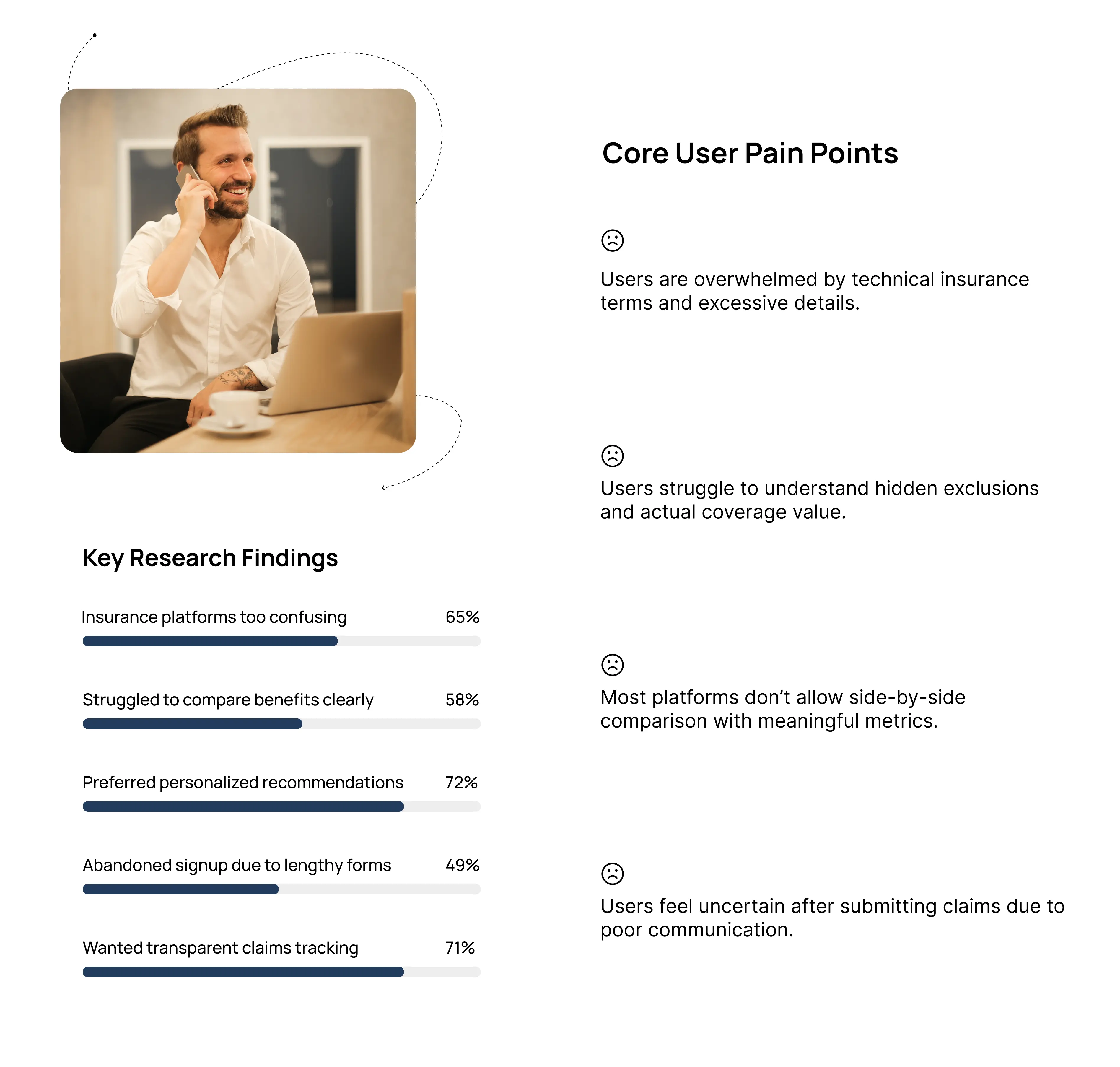
Research & Insights
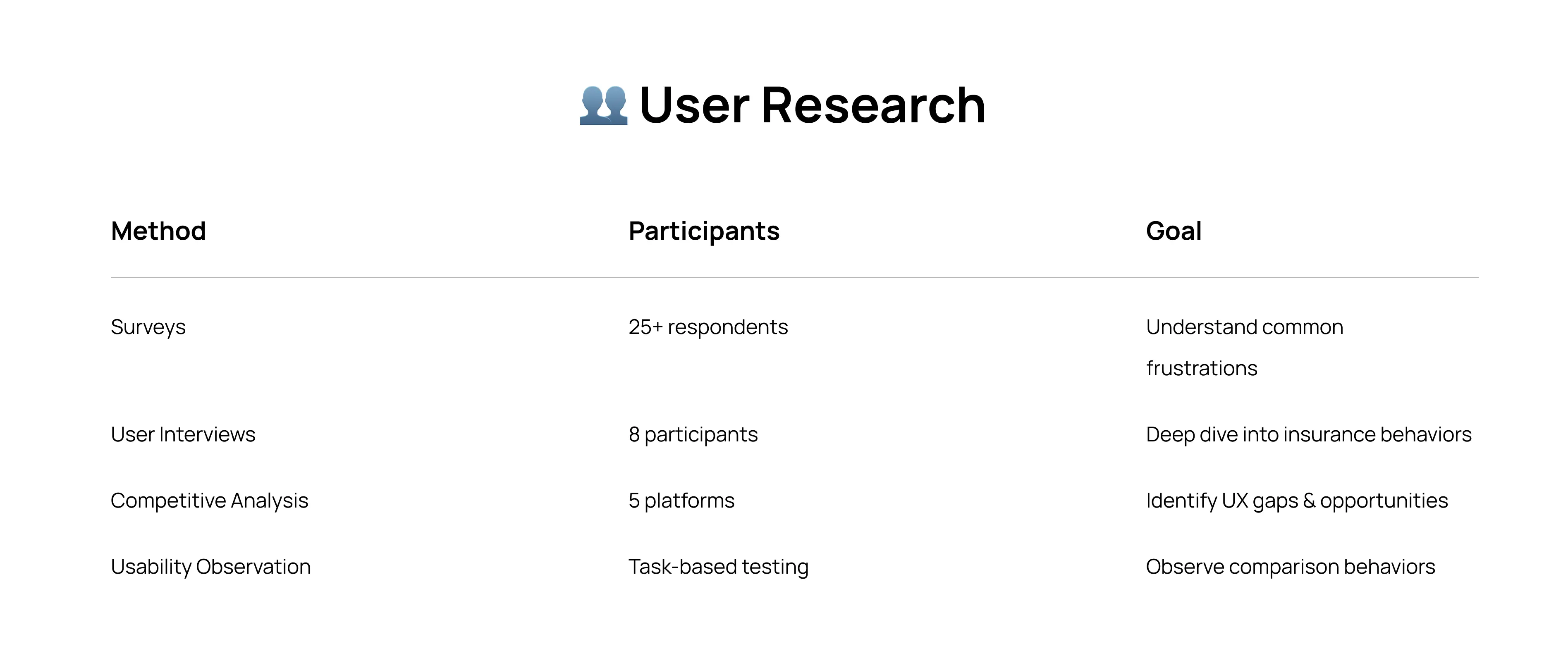
What was the research goal?
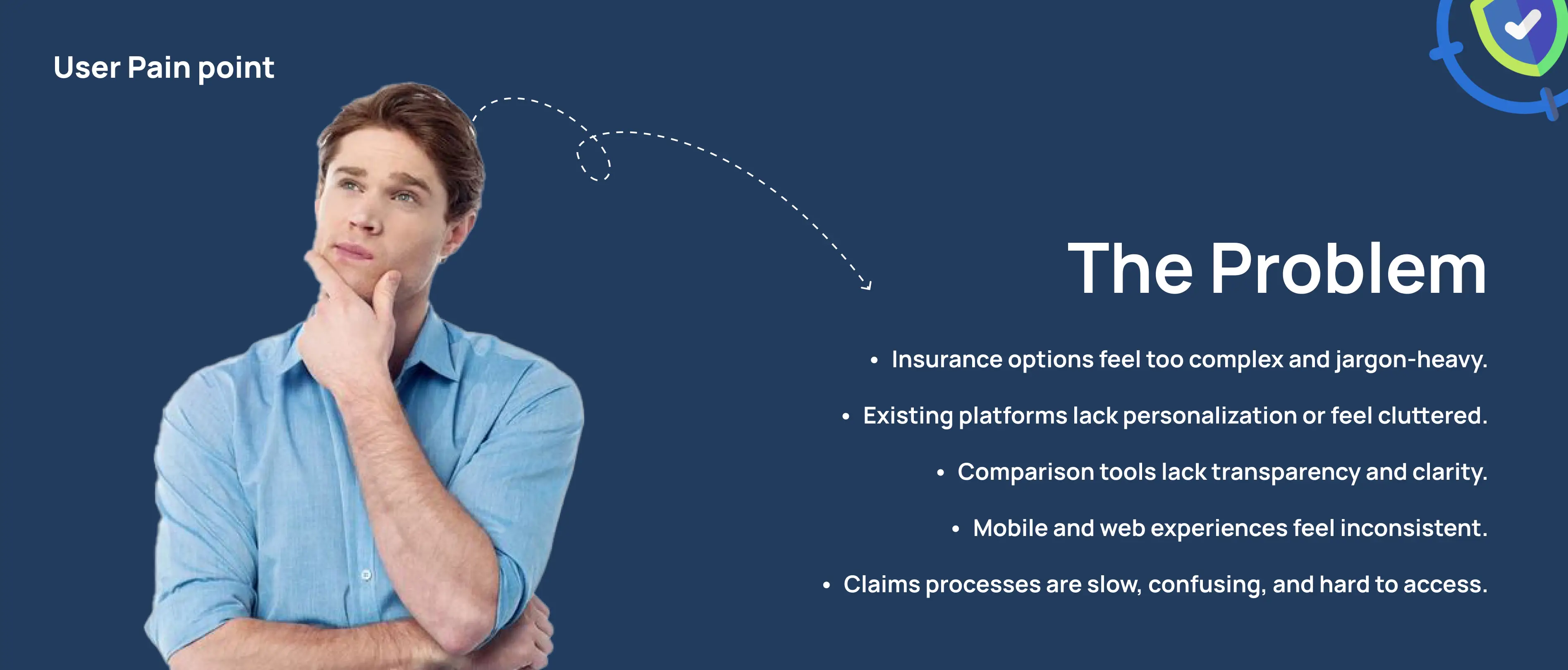
To solve this insurance decision process, the goal was to understand:
Why users struggle with insurance comparison platforms
What influences trust when choosing policies
How users currently compare insurance plans
Pain points in policy management & claims tracking
I conducted a survey to understand user behavior, frustrations, and expectations around Insurance Comparison apps. The results helped define key pain points and shape the experience of Aggregator to make it visual appealing, less complicated and trustworthy.
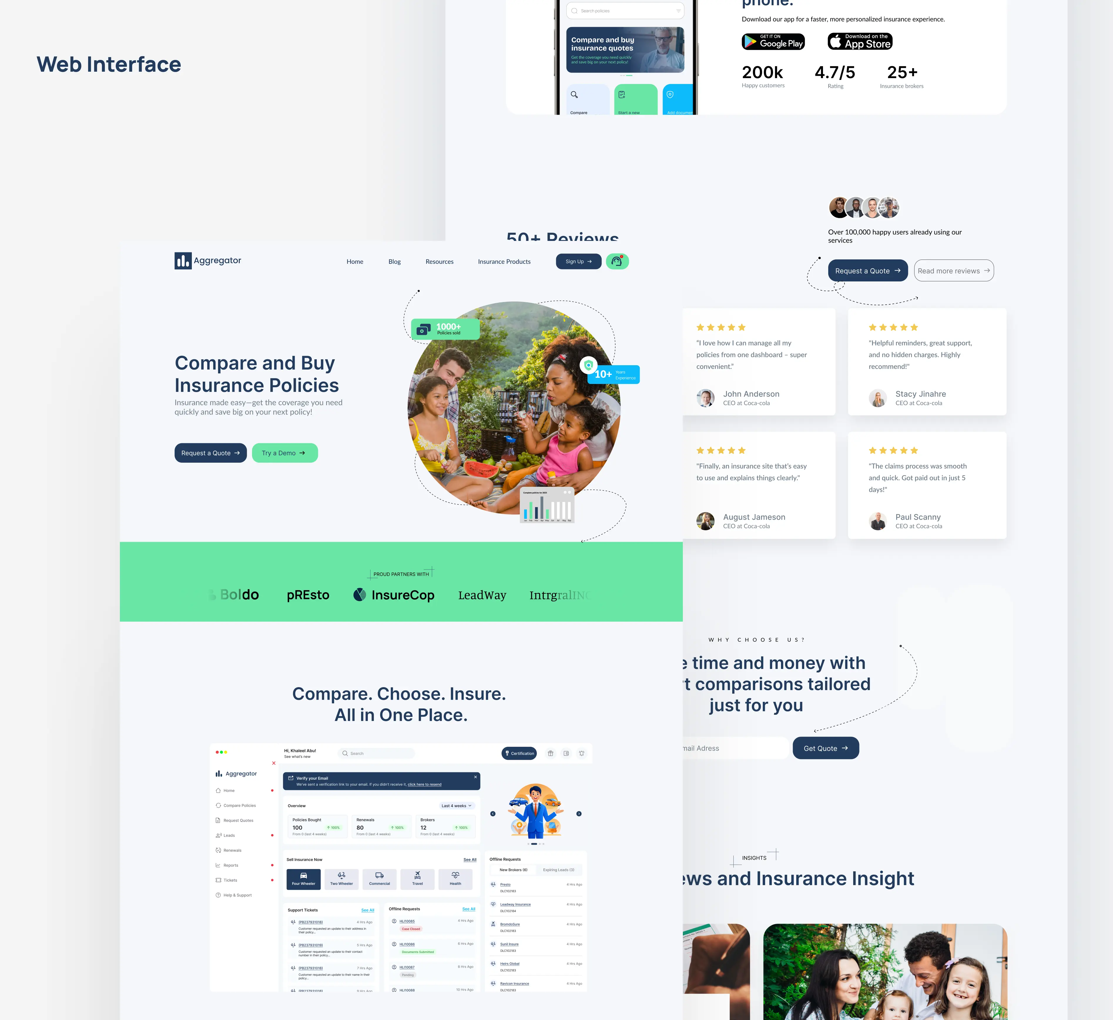
— The Web Application
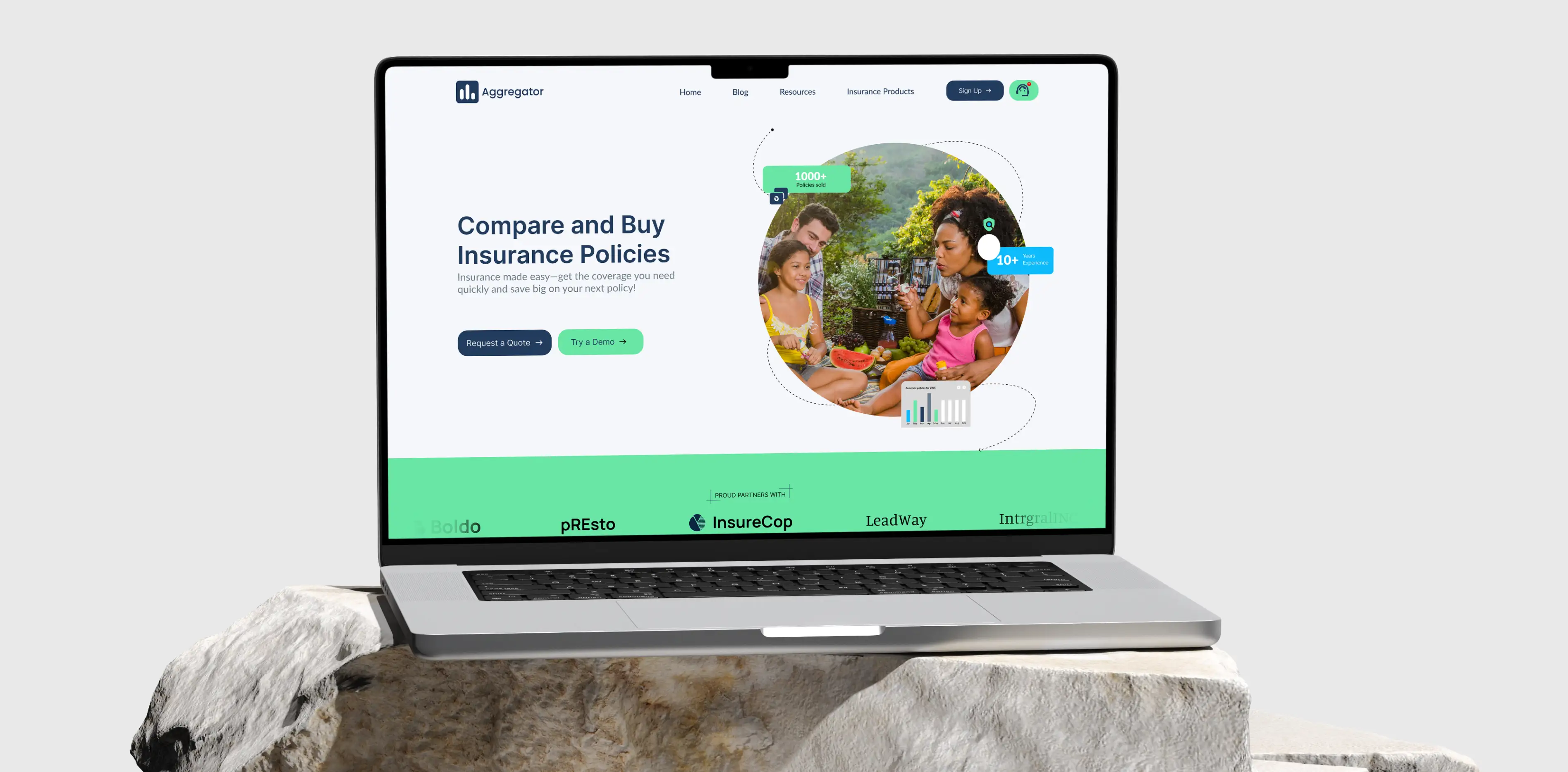
The Aggregator web application was designed to simplify the complex process of comparing and managing insurance policies through a centralized digital dashboard. Users can seamlessly compare multiple insurance plans side-by-side using clear pricing, coverage, benefits, and exclusions without navigating through multiple platforms.
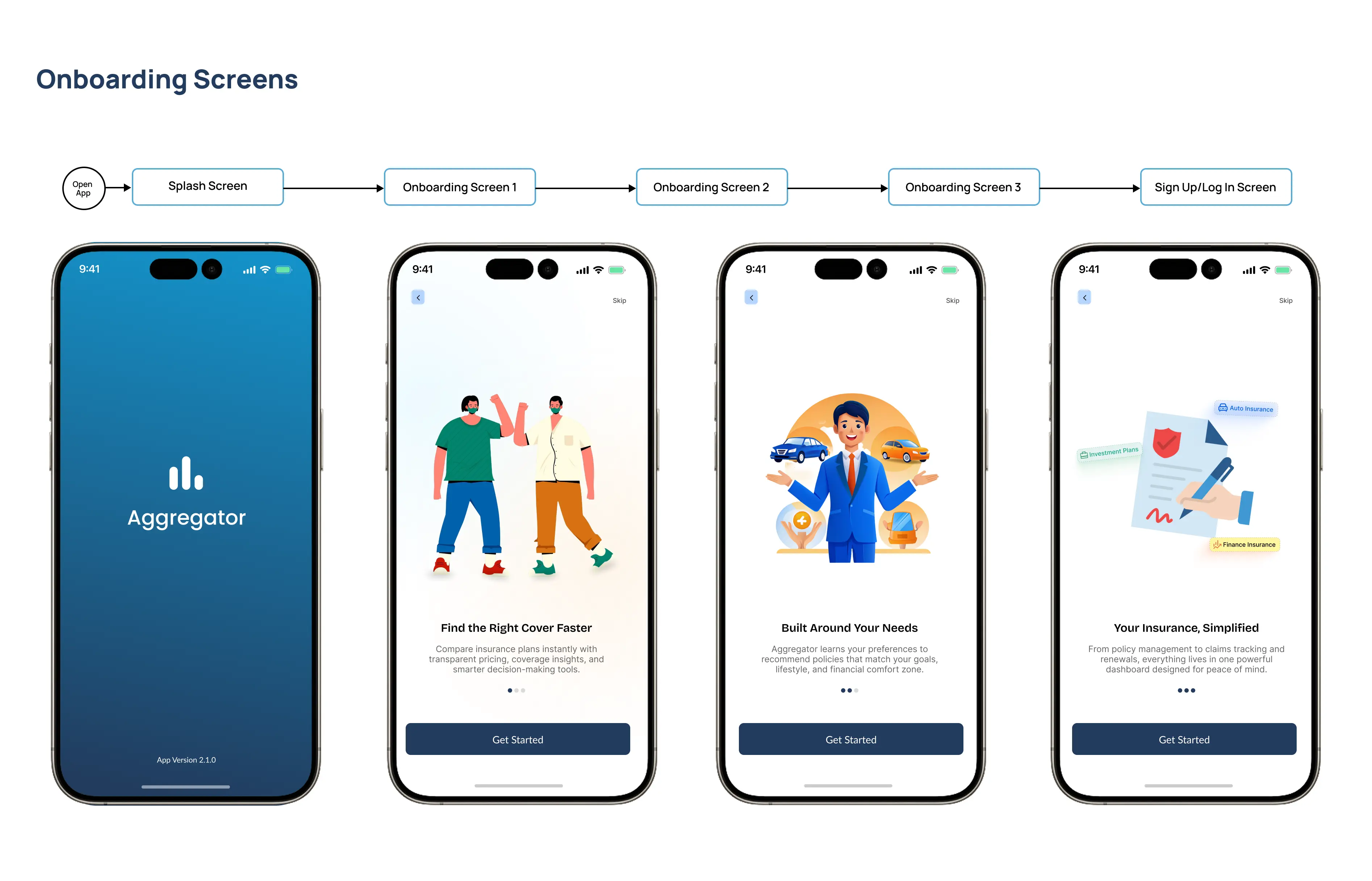
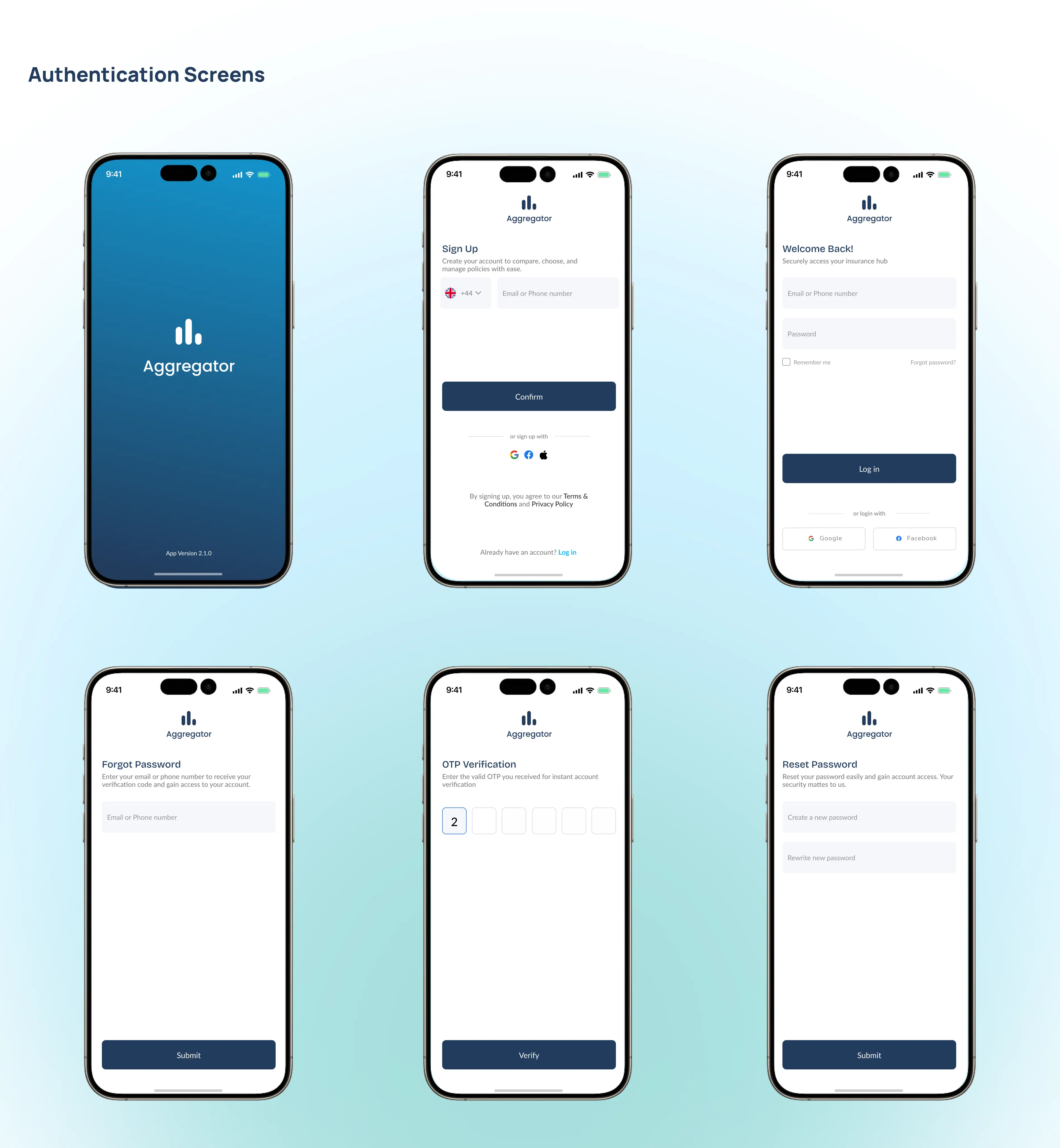
— Aggregator Mobile App Experience
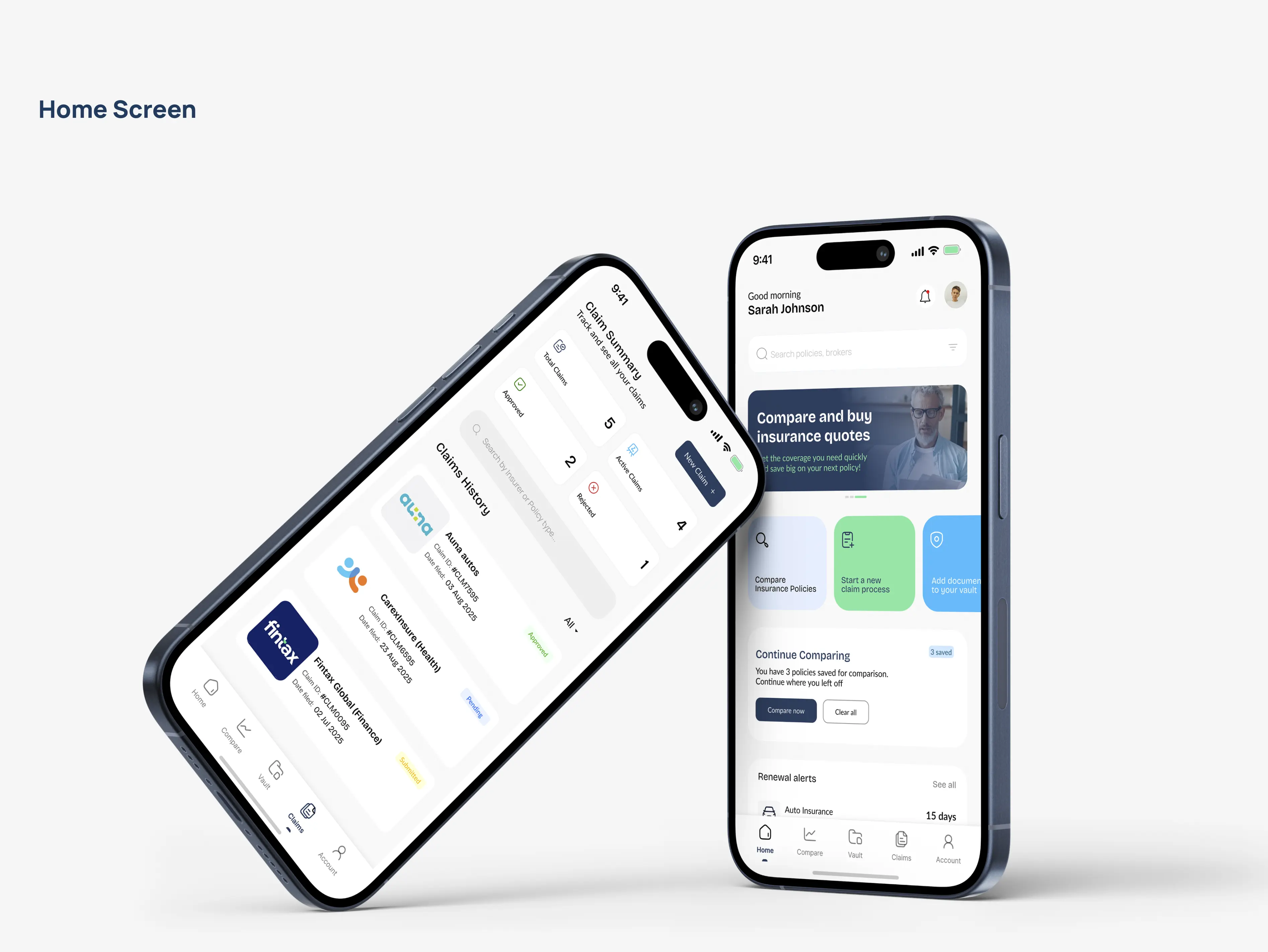
The Aggregator mobile application was designed to give users a simple, on-the-go way to compare, manage, and track insurance policies from anywhere. It focuses on a clean, card-based interface that makes policy comparison easy to understand at a glance, highlighting key differences like price, coverage, and benefits.
A lightweight dashboard allows users to view active policies, renewal reminders, and important updates in real time. Overall, the mobile experience was optimized for speed, clarity, and accessibility, ensuring users can make informed insurance decisions with minimal friction.
— The Aggregator Home Page
The idea of the homepage for Aggregator was to create a main hub after login, starting with a personalized greeting like “Good morning, [Username]” alongside quick access icons for notifications and profile. An info banner highlighted key updates, followed by quick action buttons for comparing policies, starting a claim, and adding documents to the vault. A “Continue Comparison” card allowed users to resume previous activity, while a renewal alert section helped them track expiring policies. At the bottom, a persistent navigation bar provided easy access to Home, Compare, Vault, Claims, and Account sections for smooth navigation.
— Aggregator Comparison Structure
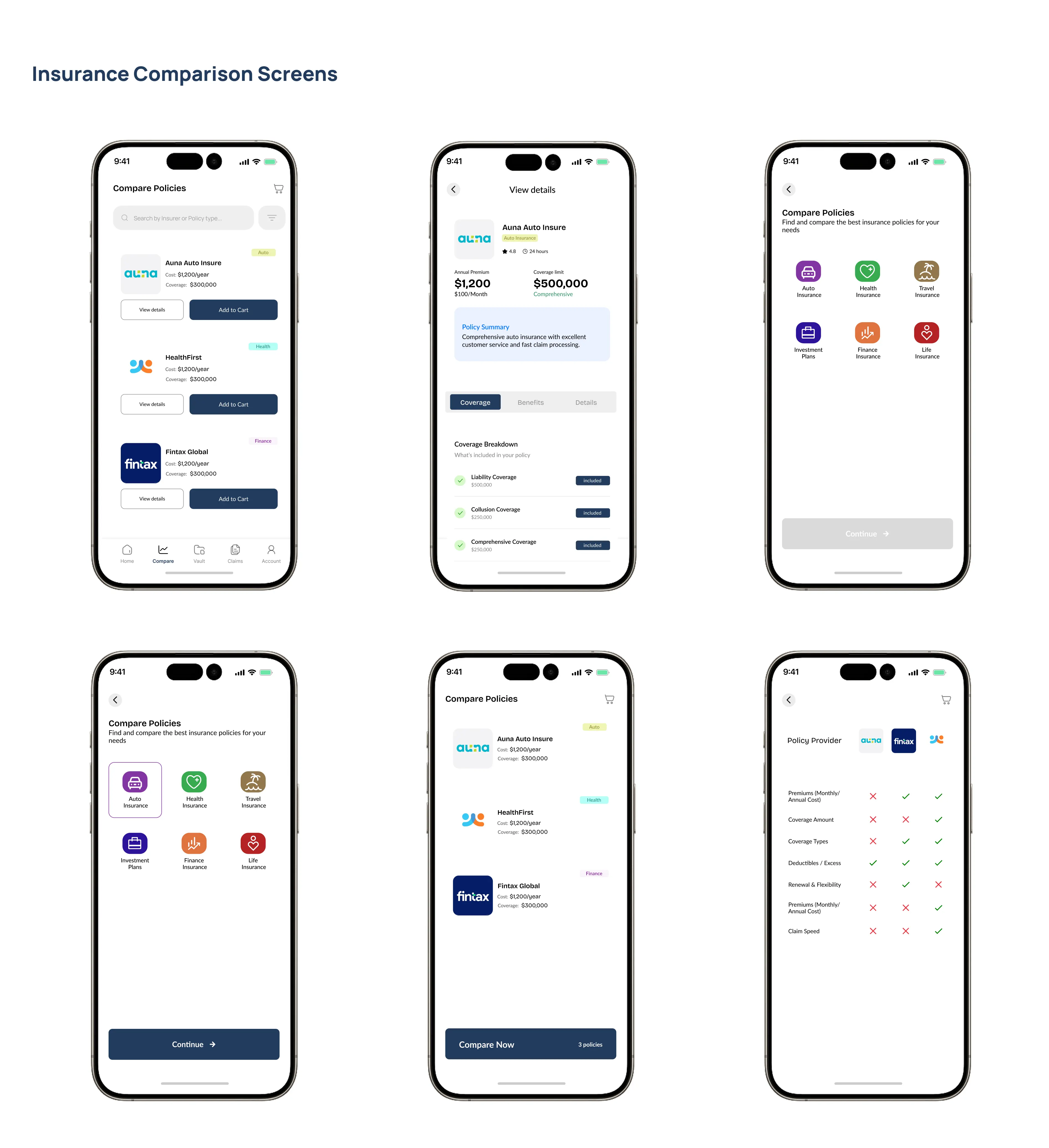
The insurance comparison screen was designed to help users easily evaluate multiple policies side-by-side without confusion. It presented key details such as price, coverage, benefits, and exclusions in a structured and visually digestible format. Filters and sorting options allowed users to refine results based on their needs and budget. The layout emphasized clarity and hierarchy, ensuring important differences between policies were immediately visible. Overall, the experience was built to simplify decision-making and reduce the cognitive load typically associated with insurance comparisons.
— Aggregator Vault for Documents
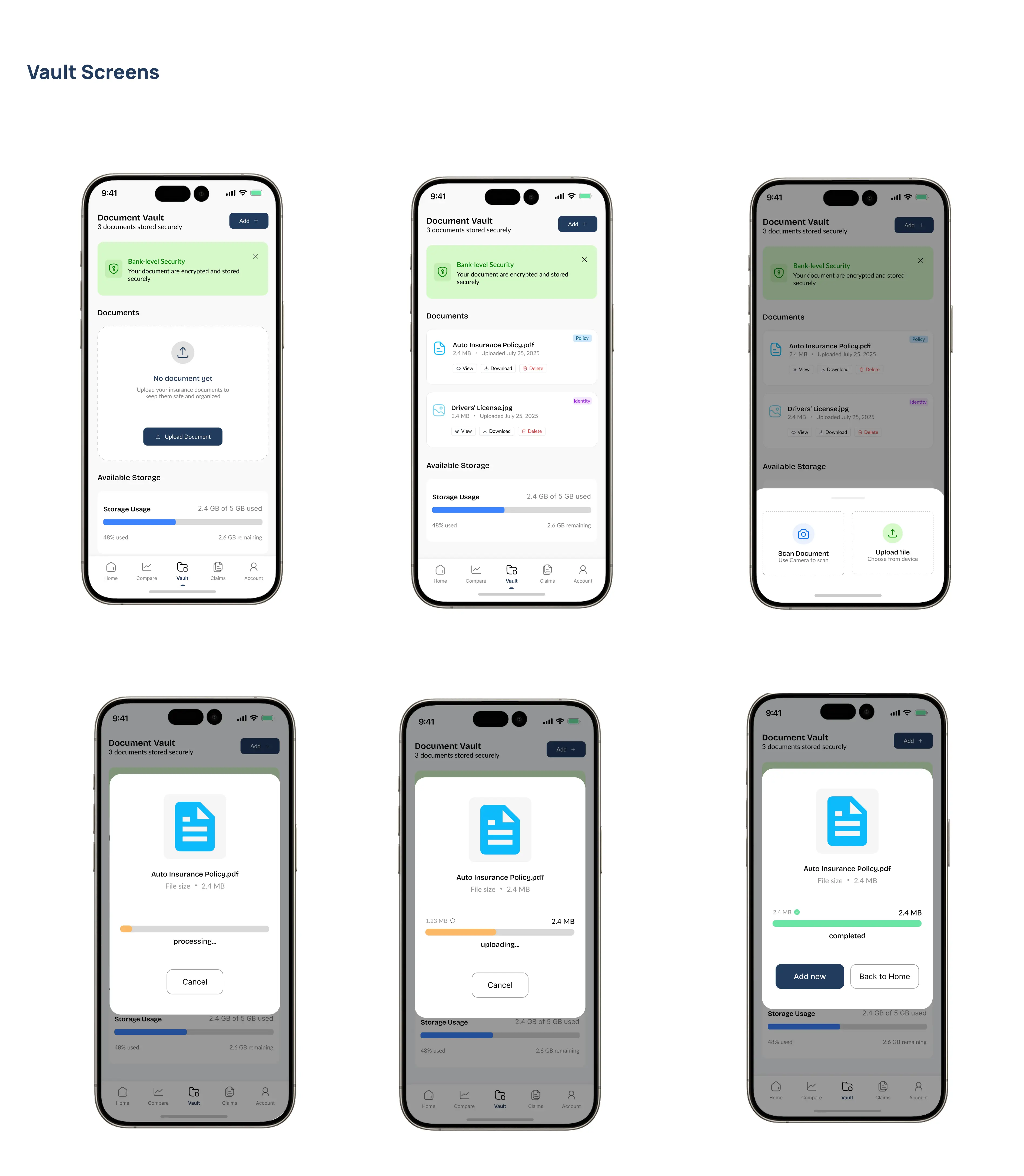
The document vault screens were designed as a secure, centralized space where users could store and manage all insurance-related documents. Users could quickly upload new files, preview documents, and access important records without friction. The interface emphasized simplicity and security, ensuring sensitive information remained protected while still being easily accessible.
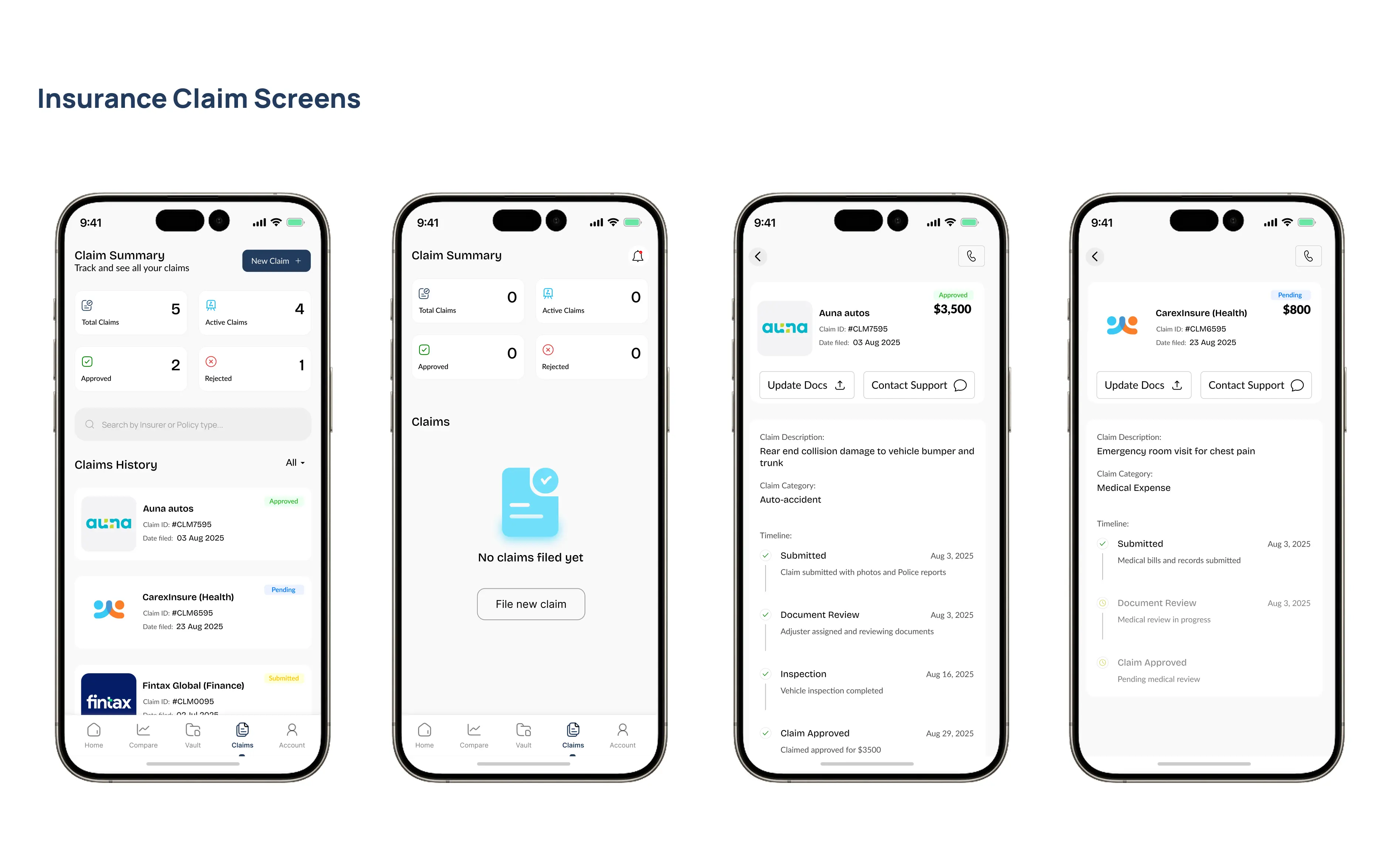
— Claim Insurance Policies
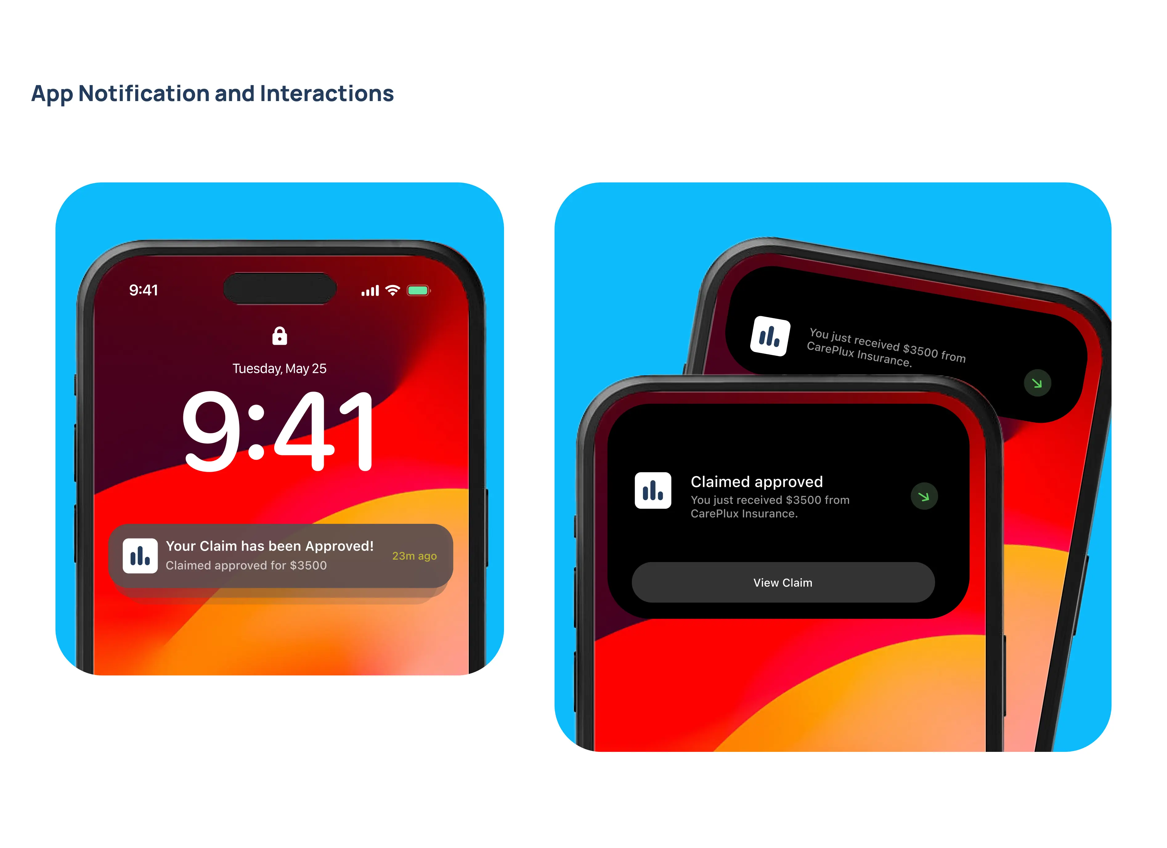
The insurance claim screens were designed to simplify what is often a stressful and complex process. Users were guided through a step-by-step flow, from initiating a claim to submission and tracking progress. Each stage was clearly labeled with visual indicators to show status updates such as submitted, under review, and approved. Required information was broken into small, manageable sections to reduce friction and avoid overwhelming the user.
— Conclusion / Key Takeaways
In conclusion, this project solved the problem of complexity and lack of transparency in insurance platforms by creating a simple, unified experience for comparing and managing policies. I focused on making information clearer, reducing user confusion, and improving decision-making through structured comparisons, personalization, and guided claims tracking.
A key takeaway for me was that users don’t need more options—they need clearer understanding of existing ones. I also learned that trust in insurance products is built through simplicity, transparency, and consistency across both web and mobile experiences.
My Key Takeaway
I learnt that reducing cognitive load is one of the most powerful tools in UX, especially for complex systems like insurance. By simplifying flows and structuring information clearly, users can make faster and more confident decisions with less effort.